Logo Development
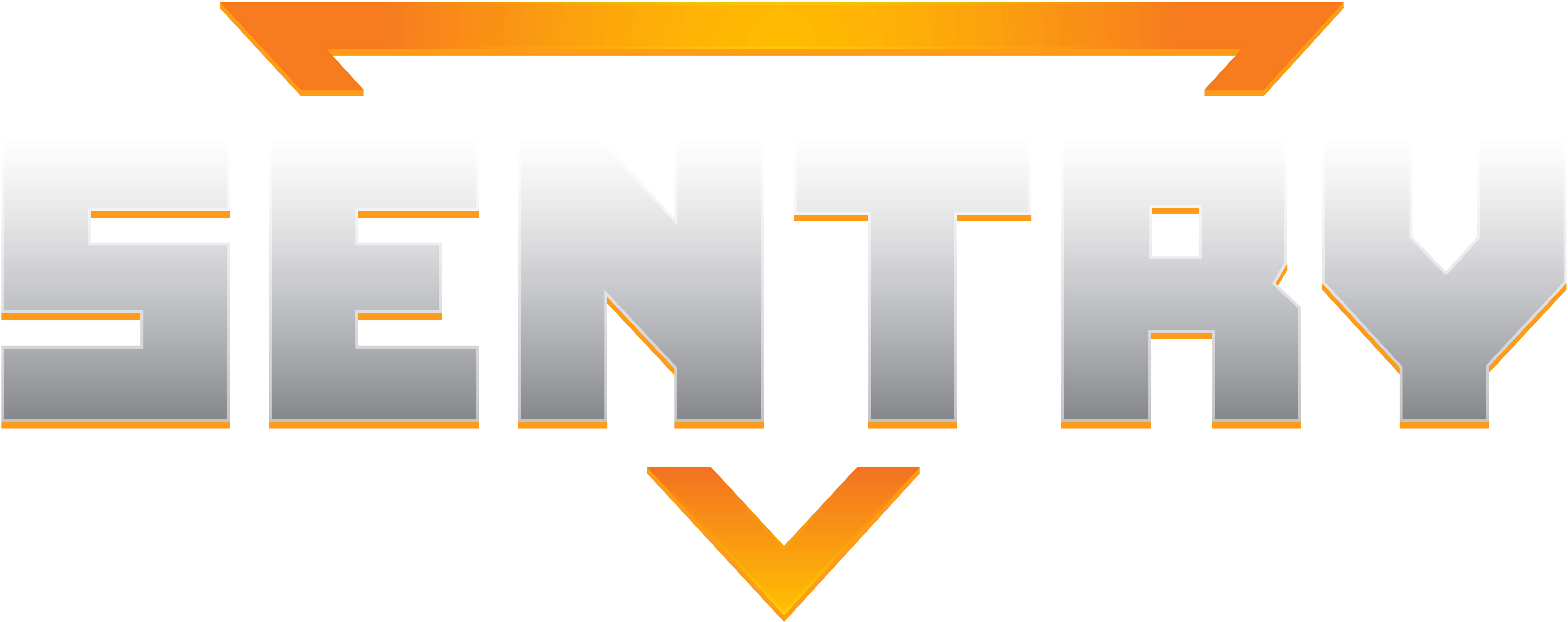
In this post we’re going to look at how we made the logo for SENTRY:

A logo is an important part of a game’s identity and in everyday life we see logos for various products all the time – but we often don’t think about the steps that lead to their final form.
As a studio, we have some experience with logo creation. On our first game Abandon Ship, we made a logo early in development, but several months later felt that it lacked clarity and was too busy, so made something simpler and more iconic. You can see the original logo below on the left, and the final one on the right:

We went into step-by-step detail on this process, as well as analysing some of what is important in logo design here. If you like this sort of thing, it’s well worth a read.
This experience helped us with SENTRY, as we felt that while we needed a logo early on (especially as we wanted to have a super-early Steam page available to start attaining Wishlists), we knew we were unlikely to hit upon our final logo until we had a much better feel for the game.
The brief for any logo should be that It is clear and legible while also being suited to the themes and tones of the game it represents. Bearing those goals in mind, we started with many variations to see if we liked any in particular:

By creating a lot of fast and loose versions, we can take or discard elements we like into future iterations. As you can see from the above sheet, we tried many different treatments on font, colour and iconography.
This helped form our thoughts until we settled on our first logo – and for those community members who have been with us since the beginning – may remember:

This version had an upside down triangle motiff that framed the logo. It was already used in elements of the game, including on the armoured breastplate of each SENTRY so felt suitable to have it represented. This, along with the font and starfield background gave a sense of the science-fiction tone, although the treatment on the font had a retro vibe, which at the time the art style leaned into.
Fast forward several months and we’re working on our Announcement Trailer, an important moment that draws a lot of attention to the game. By now, SENTRY had refined its art style, gameplay mechanics and messaging to help inform how we should update the logo. While we had a foundation to work from, we still tried a lot of variations to help us hone in on what we wanted:

Right away you can see we kept the triangle shape but tried variations on sci-fi-appropriate fonts. You can see from the final column where we hit upon our final font, although there still remained a lot of work to refine the accompanying icon and ensure the colouration worked well together.
As we started to reach the latter stages, we worked through a few final steps, namely:
- That the logo worked in real-world situations. This involved photoshopping it into various Steam pages to see if it was legible and stood out when buried in amongst other games
- That when viewed in flat colours, solely black or solely white it was still compelling. This is because a logo can be used in many different places, so it’s important that it works well in each context.
Here is an example of the non-rendered flat colour version:

We really like our logo and feel that it accomplishes those original goals of being clear, legible, compelling and suited to the themes and tones of the game.
Hopefully you’ve enjoyed this dev-blog, we’ll be breaking down other aspects of game development here over the coming months, so stay tuned!


